Let’s not sugarcoat it, SaaS is a tough business. Getting users in the door is hard enough. Keeping them? That’s where most teams quietly struggle. And the truth is, if someone signs up and runs into friction early on, they probably won’t stick around to give you feedback. They’ll just disappear.
That’s why more companies are leaning on UX specialists who know SaaS inside out. These aren’t just interface designers, they’re problem solvers. They focus on how your product feels to a real person using it for the first time, without context or guidance. Because if your user onboarding feels clunky, or your UI for SaaS isn’t intuitive, your growth will stall, no matter how strong your feature set is.
The best UX design companies for SaaS products know this. They work behind the scenes to reduce confusion, streamline navigation, and help new users accomplish something meaningful right away. That early success, however small, sets the tone for everything that follows.
More importantly, these teams don’t design in a vacuum. They align their work with product goals, growth metrics, and long-term engagement. Through thoughtful UX strategy and smart, scalable UI/UX design, they turn complex tools into experiences that feel simple and natural, even for users with no background or training.
In this guide, we’ll look at how the top UX firms approach design for SaaS. You’ll see what they prioritize, how they improve retention, and what makes their process different. Because in this space, the way your product works is only half the story. How it feels to use is what actually keeps people coming back.
Understanding UX Strategy in the SaaS Context
UX in SaaS isn’t just about how your product looks, it’s about how it works when someone’s using it under pressure, with limited time, and no manual. A strong UX strategy connects design decisions directly to user behavior: how quickly they get value, how often they come back, and whether they feel confident using your tool without getting lost.
That’s where the top UX partners for SaaS products shine. They don’t jump into visuals first. Instead, they begin by asking hard questions: Where are people dropping off? Which parts of onboarding feel heavy? What’s stopping users from reaching the features that matter?
They treat UX like a system, not just a set of screens.
One thing these teams focus on early is consistency. If similar actions are placed in different spots across your app, or if labels shift between screens, users hesitate. They start second-guessing the flow. That’s friction. And friction breaks retention.
Then comes personalization. Whether you’re designing for small teams or enterprise-level workflows, the best UX agencies tailor flows based on roles, permissions, or user intent. It’s not about making everything dynamic, it’s about making the right things feel familiar from the start.
Usability also plays a huge role. It might sound obvious, but you’d be surprised how many products bury their core actions behind too many steps. Good UX teams simplify paths. They use journey mapping, audit workflows, and test assumptions, long before the first pixel is placed.
Instead of Slack, consider how tools like Loom guide new users. The initial experience is built around a clear, single goal: record your first video. No fluff, no over-explaining, just forward movement.
That’s the real impact of an effective UX strategy. It’s about actually making them feel effortless, and that’s the kind of experience users stick with.
UI/UX Design Principles That Improve SaaS User Retention
SaaS retention isn’t just won through strategy, it’s reinforced by execution. And execution lives in the product’s UI and UX design. The way screens are laid out, how users interact with forms, how feedback is shown, these micro-decisions compound into habits, or frustration.
Below are essential design principles that directly influence retention:
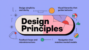
1. Design Simplicity and Clarity
Simplicity isn’t about minimalism, it’s about focus. Each screen should do one thing well.
– Prioritize user goals on each page
– Eliminate unnecessary steps or friction
– Avoid overloading screens with options
2. Visual Hierarchy That Guides Behavior
Smart layout helps users intuitively understand where to look, click, and move next.
– Use contrast and spacing to create focus areas
– Align calls-to-action with the natural reading flow
– Make primary actions obvious; de-emphasize secondary ones
3. Feedback Loops and Microinteractions
Users need to feel the system is responding. Microinteractions give them that confidence.
– Loading animations, success indicators, inline validation
– Visual cues after saving or submitting data
– Subtle transitions that confirm progress without breaking flow
4. Navigation That Matches Mental Models
Confusing navigation is one of the fastest ways to lose users.
– Keep menu structures predictable and consistent
– Use recognizable icons, labels, and UI patterns
– Always show users where they are and how to go back
Table: Traditional vs. Modern UI Patterns in SaaS
|
Feature |
Traditional UI |
Modern SaaS UI |
|
Navigation |
Static sidebar |
Collapsible, adaptive nav bars |
|
Error Handling |
Modal popups |
Inline validation + tooltips |
|
Dashboards |
Dense, table-heavy |
Modular, card-based layouts |
|
User Feedback |
Minimal or passive |
Real-time feedback with context |
The best UI for SaaS products is invisible, it lets users accomplish tasks without overthinking. And when done right, it becomes a quiet but powerful force behind retention.
Mastering User Onboarding for Long-Term Engagement
First impressions for the best UX design companies for SaaS products aren’t just important, they’re everything. The onboarding flow is where users decide whether your product makes sense, feels approachable, and solves their problem. If they get lost, overwhelmed, or see too many empty states? They’re gone.
A well-designed onboarding experience reduces cognitive load and accelerates time to value (TTV). And that’s exactly what drives retention in the first 7–14 days of product use.
Key Elements of a High-Retention Onboarding Flow:
– Guided Tours – Walk users through core workflows step by step
– Progressive Disclosure – Don’t overwhelm with everything at once; reveal features contextually
– Smart Defaults – Pre-fill settings where possible to reduce decision fatigue
– Empty State Design – Show examples or demo content when data is missing
Case Study: Notion’s Onboarding Success
Notion, a flexible productivity tool, saw a 35% lift in 7-day activation by redesigning its onboarding experience. Instead of dumping users into a blank workspace, they introduced example templates, tooltips, and a soft checklist. That shift helped new users build something useful on day one, without needing tutorials.
Personalization also plays a role. Tailoring the onboarding experience based on user role or intent (e.g., developer vs. marketer) increases perceived relevance and reduces drop-off.
Most best UX design companies for SaaS products now treat onboarding not as a one-time task, but a living part of the product lifecycle, tested, iterated, and measured continuously.
In SaaS, activation is the first battle. And onboarding is the strongest weapon you’ve got.
UX Metrics and Retention Analytics
Good UX isn’t subjective, it’s measurable. And for the best UX design companies for SaaS products, where retention is directly tied to recurring revenue, knowing which metrics to track (and how to act on them) is essential.
UX and retention analytics work together to tell you where users succeed, struggle, or silently disappear. It’s not just about how many users sign up, it’s about how many stay engaged over time.
Key UX Metrics for SaaS Products
– DAU/WAU (Daily/Weekly Active Users)
Tracks ongoing engagement. Sharp drops often signal UX friction or product fatigue.
– Time to Value (TTV)
The time it takes for a new user to experience their first “aha” moment. Lower is better.
– Feature Adoption Rate
Measures which features are actually being used. Helps identify underperforming or confusing parts of the UI.
– Task Success Rate & Completion Time
Tells you if users can complete key workflows without getting stuck or abandoning the process.
Behavioral Analytics in Action
Tools like Hotjar, Mixpanel, and FullStory offer heatmaps, session recordings, and funnel tracking. These don’t just show what users click, they reveal hesitation points, rage clicks, and drop-off spots across the UI for SaaS interfaces.
Example: Cohort Analysis to Identify UX Gaps
Let’s say your data shows users from Week 1 churned more than those from Week 3. Why? A cohort analysis might reveal that a new onboarding tweak introduced in Week 3 reduced confusion during account setup. That insight could lead to a permanent UX improvement.
Retention doesn’t improve by guessing. It improves by observing, measuring, and responding to user behavior with intent.
How the Best UX Design Companies Approach SaaS Products
Behind every intuitive, easy-to-love SaaS product is a team, or often a design partner, that really gets what users want, what businesses need, and how to bridge the two. The best UX design companies for SaaS products don’t just make things look clean or modern. They build systems that users come back to. Over and over again.
So, what makes these teams stand out?
What Sets Top UX Firms Apart
They start with the user.
That means research before redesign. Interviews, usability tests, heatmaps, whatever it takes to understand the people behind the clicks. These decisions aren’t based on guesses. They’re based on data.
They design for scale.
A sleek layout isn’t enough. The best UX design companies for SaaS products build full-blown design systems, reusable components, documented patterns, scalable UI foundations. That’s how you keep things consistent when your product grows.
They think like product managers.
Not just designers. They understand activation metrics, funnel drop-offs, lifetime value, and conversion events. Their design work supports core KPIs, not just aesthetics.
They work closely with dev and growth.
No handoffs. No silos. The best firms embed into teams, iterate fast, and rely on feedback loops between design, product, and engineering.
Real-World Standouts
– Clay helped Intercom redesign its interface, improving clarity and boosting user engagement.
– Ramotion worked with companies like Mozilla and Salesforce to rework onboarding flows and feature discovery.
– Frog Design is known for solving big UX problems in complex platforms, especially in data-heavy, enterprise-level SaaS.
These agencies don’t just ship pretty dashboards. They design with intent. Their goal is to create user flows that teach, support, and scale, without users feeling lost or overwhelmed.
And that’s exactly the kind of edge modern SaaS products need to stay competitive.
Evolving UX Over Time: Continuous Research and Testing
Here’s the truth: good UX is never “done.” Not in SaaS. Products evolve, new features get added, user needs shift, and expectations keep rising. That’s why the best UX design companies for SaaS products treat UX like a living, breathing part of the product, not a one-time design sprint.
So, how do they keep things sharp over time?
Testing That’s Ongoing, Not Occasional
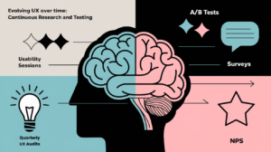
Usability sessions uncover where users get stuck, often in ways analytics can’t show. These sessions reveal hesitation, frustration, and all the little places where people slow down or give up.
A/B tests help answer questions like: does this button get more clicks when it’s green or blue? Does changing the layout make users finish setup faster? You don’t always need a full redesign, sometimes, one small tweak makes a big difference.
Surveys and NPS capture feedback at scale. Over time, these tools can flag when satisfaction is slipping, and why.
Top teams don’t stop after shipping. Many run quarterly UX audits, taking a fresh look at the interface, reviewing support tickets, and checking user behavior patterns to see what’s working (and what’s not).
One Quick Example
Basecamp once simplified their onboarding by removing a single, unnecessary step, picking a default project category. That tiny change? It bumped activation by 15% in a week. And it didn’t come from guesswork, it came from watching users struggle in real sessions.
The best UX design companies for SaaS products don’t chase perfection. They chase alignment. They adjust based on what users are actually doing, not what they assume users want. That responsiveness? It’s what keeps UX relevant, and retention high.
Because in SaaS, what worked last quarter might fall flat tomorrow. And if your experience doesn’t adapt, your users won’t either.
Technical FAQs
Q1: How does UX design impact user churn in SaaS?
When a product’s experience feels clumsy or unclear, especially during user onboarding, users tend to drop off quietly. Confusing navigation, missing feedback, or poorly placed actions create friction. Good UI/UX design smooths out those edges. The more effortless it feels to get value, the more likely users are to stick around.
Q2: What’s the ideal onboarding length for SaaS platforms?
Not exactly, but there is an ideal outcome: getting users to their first win fast. For most SaaS tools, the first “aha” moment should happen within the first 2 to 5 minutes. The best UX design companies for SaaS products often rely on progressive onboarding, introducing features gradually instead of dumping everything on the user at once.
Q3: Can poor UI design be offset by strong customer support?
In some cases, maybe. But over time, it breaks. If users constantly need help navigating, something’s wrong with the design itself. The best UX design companies for SaaS products know that the interface should explain itself. Support should be a backup, not a lifeline.
Q4: How often should UX testing be done in a SaaS lifecycle?
It should be ongoing. Quarterly usability testing is a minimum. Fast-growing teams may run A/B tests, user interviews, or behavior audits monthly. The point is to evolve your UX strategy as your product (and user base) changes.
UX as a Strategic Growth Driver in SaaS
UX isn’t a nice-to-have in SaaS. It’s a core engine for growth. From onboarding to everyday use, great UI for SaaS products builds confidence, clarity, and trust. Poor UX, meanwhile, quietly chips away at retention.
The best UX design companies for SaaS products understand this deeply. They don’t just design. They solve. Their work often hides in plain sight, in faster onboarding, cleaner flows, and fewer support tickets. But the results? They show up in active users, upsells, and lower churn.
These agencies specialize in turning complex systems into simple interactions. Through refined UX strategy, thoughtful UI/UX design, and data-driven iteration, they craft journeys that feel less like a walkthrough, and more like a conversation.
So if your product looks good but doesn’t stick? Don’t just add features. Revisit the experience. Because more often than not, your next growth breakthrough won’t come from code, it’ll come from design.
Do you like to read more educational content? Read our blogs at Cloudastra Technologies or contact us for business enquiry at Cloudastra Contact Us